For years, web developers have struggled to fully customize HTML <select> elements. Default browser styling limited creativity, often forcing teams to build complex JavaScript solutions that compromised accessibility or compatibility.
Now Chrome 135 introduces a significant update that makes select elements both highly customizable and accessible for developers.
How appearance: base-select Allows Customization
The new appearance: base-select CSS property is at the heart of this evolution. Applying it to a <select> element unlocks a powerful set of features:
- Browsers now honor richer HTML markup inside <option> elements.
- Developers gain control over new internal parts and states for advanced styling and animation.
- Out-of-the-box minimal styling provides a blank canvas for creativity.
- Options appear in a top-layer popover, positioned precisely with anchor() for better UI
design.
While base-select opens new doors, it also brings changes. Popup menus stay within the browser window, mobile OS pickers are no longer triggered, and the select’s width is decoupled from the longest option.
These adjustments provide consistency and empower designers to create unique form controls.
Demo
<form>
<p>
<label for="pet-select">Select pet:</label>
<select id="pet-select">
<button>
<selectedcontent></selectedcontent>
</button>
<option value="">Please select a pet</option>
<option value="cat">
<span class="icon" aria-hidden="true">🐱</span
><span class="option-label">Cat</span>
</option>
<option value="dog">
<span class="icon" aria-hidden="true">🐶</span
><span class="option-label">Dog</span>
</option>
<option value="hamster">
<span class="icon" aria-hidden="true">🐹</span
><span class="option-label">Hamster</span>
</option>
<option value="chicken">
<span class="icon" aria-hidden="true">🐔</span
><span class="option-label">Chicken</span>
</option>
<option value="fish">
<span class="icon" aria-hidden="true">🐟</span
><span class="option-label">Fish</span>
</option>
<option value="snake">
<span class="icon" aria-hidden="true">🐍</span
><span class="option-label">Snake</span>
</option>
</select>
</p>
</form> Copyselect,
::picker(select) {
appearance: base-select;
}
* {
box-sizing: border-box;
}
html {
font-family: Arial, Helvetica, sans-serif;
}
body {
width: 100%;
padding: 0 10px;
max-width: 480px;
margin: 0 auto;
}
h2 {
font-size: 1.2rem;
}
p {
display: flex;
gap: 10px;
}
label {
width: fit-content;
align-self: center;
}
select {
flex: 1;
}
select {
border: 2px solid #ddd;
background: #eee;
padding: 10px;
transition: 0.4s;
}
select:hover,
select:focus {
background: #ddd;
}
select::picker-icon {
color: #999;
transition: 0.4s rotate;
}
select:open::picker-icon {
rotate: 180deg;
}
::picker(select) {
border: none;
}
option {
display: flex;
justify-content: flex-start;
gap: 20px;
border: 2px solid #ddd;
background: #eee;
padding: 10px;
transition: 0.4s;
}
option:first-of-type {
border-radius: 8px 8px 0 0;
}
option:last-of-type {
border-radius: 0 0 8px 8px;
}
option:not(option:last-of-type) {
border-bottom: none;
}
option:nth-of-type(odd) {
background: #fff;
}
option:hover,
option:focus {
background: plum;
}
option .icon {
font-size: 1.6rem;
text-box: trim-both cap alphabetic;
}
selectedcontent .icon {
display: none;
}
option:checked {
font-weight: bold;
}
option::checkmark {
order: 1;
margin-left: auto;
content: "☑️";
}
::picker(select) {
opacity: 0;
transition: all 0.4s allow-discrete;
}
::picker(select):popover-open {
opacity: 1;
}
@starting-style {
::picker(select):popover-open {
opacity: 0;
}
}
::picker(select) {
top: calc(anchor(bottom) + 1px);
left: anchor(10%);
} Copy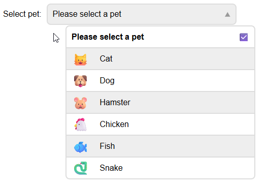
Richer Content Inside Options
Traditionally, browsers stripped out images, SVGs, and custom markup from <option> elements. Now, base-select allows for icons, avatars, and styled spans directly inside options.
This advancement enables visually appealing select menus: think status dots, user avatars, and color pickers using only native elements and CSS. Developers can now avoid heavy JavaScript workarounds and deliver richer user interfaces.
Full Customization and Animation
Every visible part of a base-select can be replaced, styled, or animated. Early examples show select menus with custom labels, color previews, and animated status indicators, all built natively. This flexibility allows for creative freedom while maintaining accessibility and usability.
Seamless JavaScript Compatibility
The JavaScript interface for <select> remains unchanged, ensuring that existing scripts continue to function. However, developers should verify how selected values are parsed when using rich content, as extracting a selected string may work differently. Assigning the value attribute to options helps maintain backward compatibility and reliability.
Resources and Community Support
Chrome is the first browser to support these features, but other major browsers have contributed to the specification and are expected to implement it soon. Developers can find updated documentation, demos, and guides on MDN, Open UI, and other community hubs, making it easy to experiment and learn.
Takeaway: A New Era for Web Forms
The customizable <select> element is a milestone for web designers and developers. It promises more flexible, attractive, and accessible form controls, reducing the need for custom scripts and external libraries. As support grows, expect to see more dynamic and modern UI components built with native HTML and CSS.


Customizable HTML Select Elements with Chrome 135